Information checkedInformation unaudited Information geprüft Information ungeprüft 162 years of change and growth
The history of Liechtensteinische Landesbank is a remarkable journey, which extends from its beginnings as a regional savings and lending bank to its present position as an internationally active universal bank. In the following paragraphs we want to take you on a journey through time to investigate the development of our name and our brand. A special milestone occured in 1955, as the first logo of Liechtensteinische Landesbank was introduced, a logo that still distinguishes our visual identity today. The story of our logo highlights just how far we have come and how much we value our origins, while at the same time looking to the future with confidence.
1861

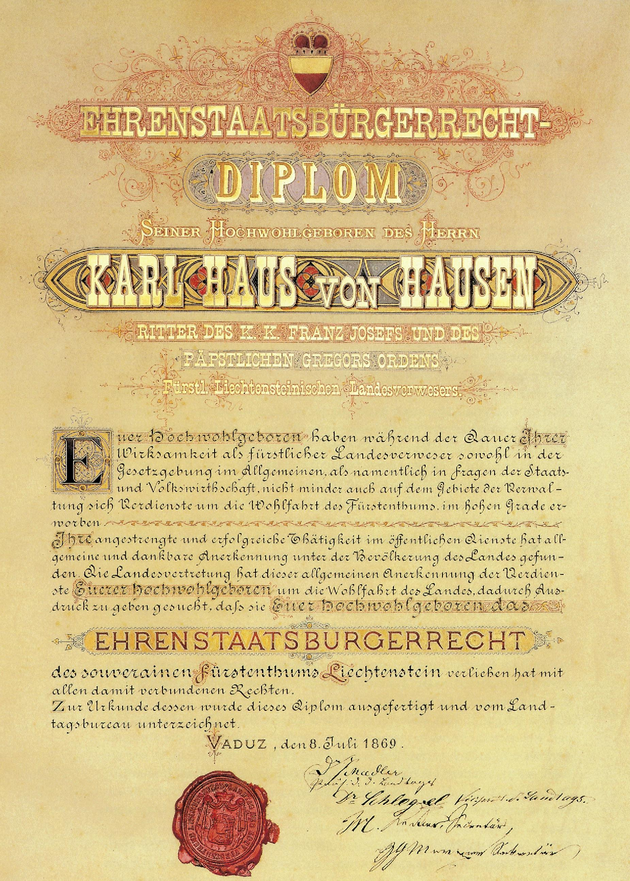
Founding of the “Zins- und Credit-Landes-Anstalt”
On the initiative of Country administrator Karl Haus von Hausen, the “Zins- und Credit-Landes-Anstalt i the souvereign Principality of Liechtenstein” was founded. It offered Liechtensteinʼs inhabitants the security to desposit their savings while supporting farmers and tradesmen who were experiencing financial difficulties.
1864
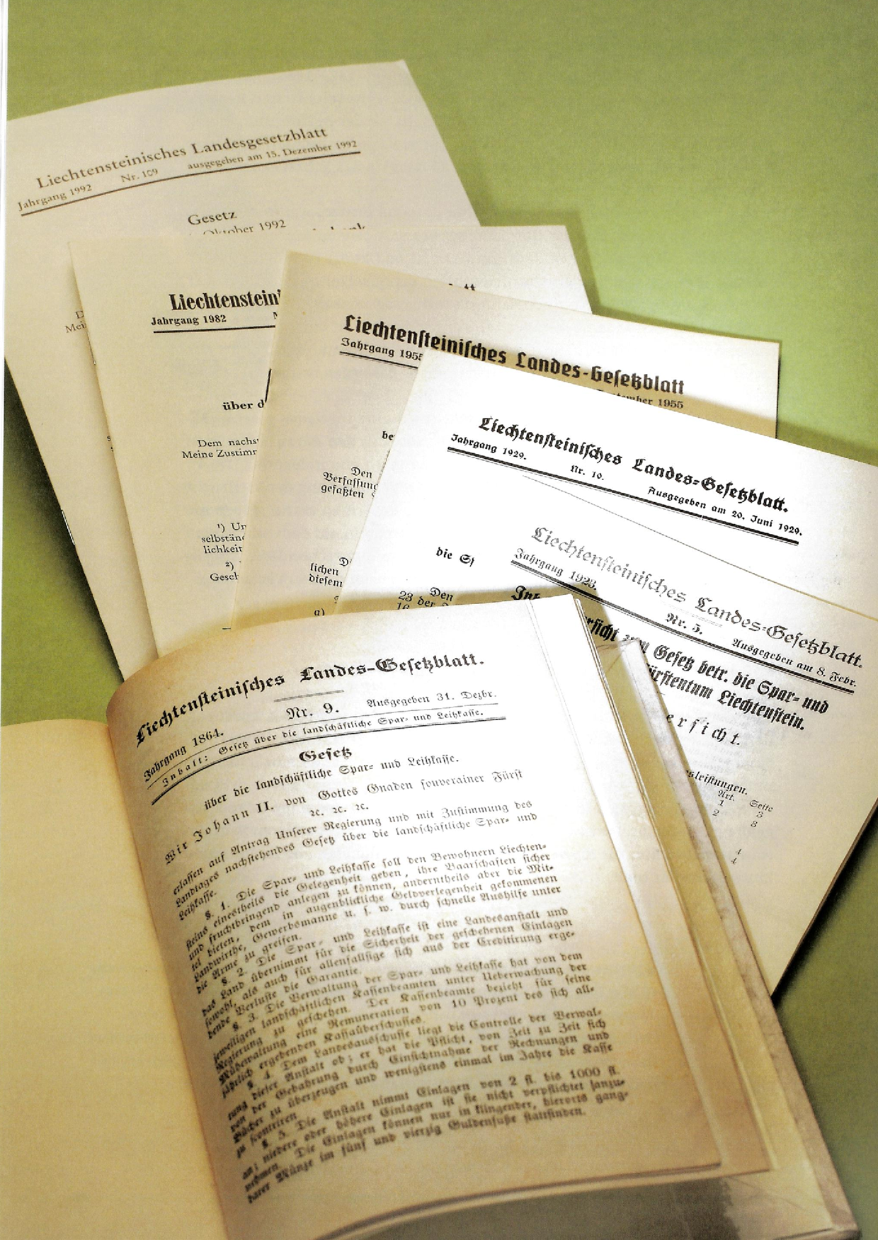

Renaming as “Landschaftliche Spar- und Leihkasse”
The financial institution changed its name to “Landschaftliche Spar- und Leihkasse”. However, itʼs main purpose remained the same, i.e. acceptance of savings deposits and the granting of loans to promote the economy and moderniseation in the Principality.
1875
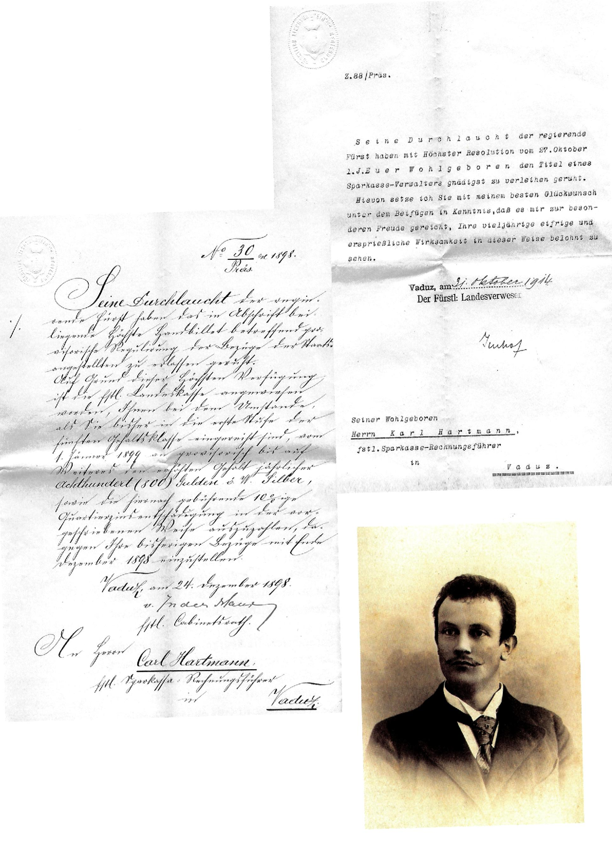
“Spar- und Leihkasse des Fürstentums Liechtenstein”
The popularly called “Sparkassa” (savings bank) grew into a business that not only managed savings but also granted loans. Small loans enabled investments to be made in agriculture and commerce, which contributed to the economic development of the country. The bank was given permission to invest in foreign securities enabling a broader investment strategy.
1955
Renaming as “Liechtensteinische Landesbank”
The bank developed into an internationally active universal bank, and the first logo was created to establish its visual identity. New services were introduced to fulfil the needs of a global clientele. A broad spectrum of financial transactions was offered including cheques, bills of exchange, mortgage bonds and securities trading.
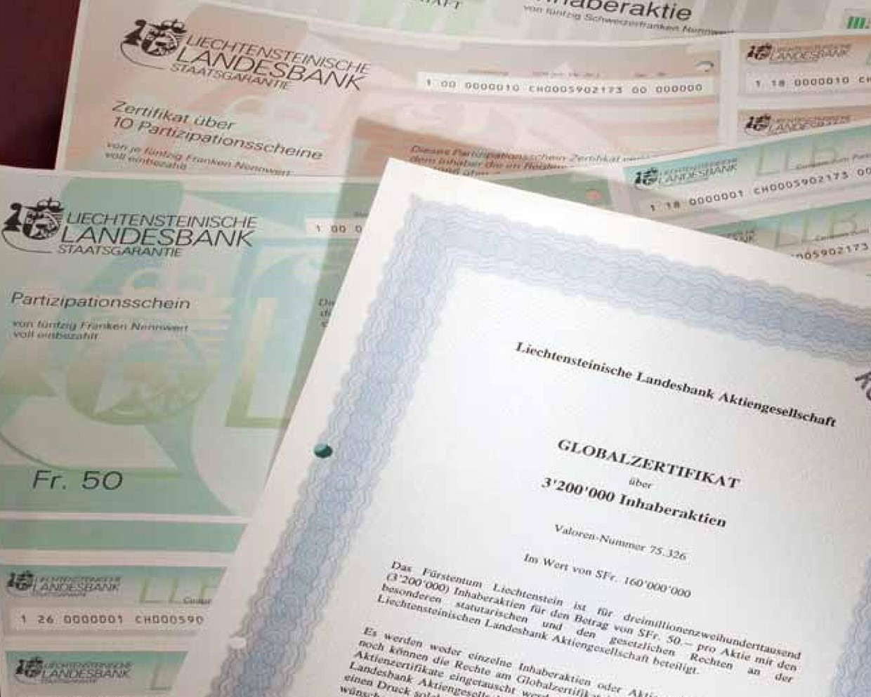
1993

Corporate changes prompt new logo design
From a public-law institute to an “Aktiengesellschaft” (joint stock company). A listing on the Swiss Exchange and Liechtensteinʼs accession to the EEA paved the way to the future. In the middle of these changes our logo was also redesigned. For the first time the abbreviation “LLB” was integrated in the logo and this was joined for the first time by the date of the bankʼs founding; an acknowledgement of our historical roots and and a reference to our continual development.
2007
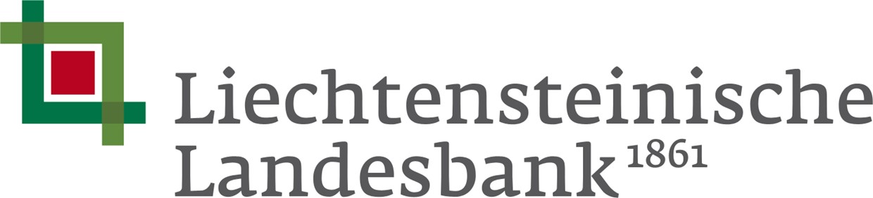
Our classic modern logo
We have never forgotten our roots in the region. Throughout all our constant growth and expansion abroad we have stayed true to our origins. A classic modern logo was introduced symbolising security, openness and partnership. The green colour represents our origin, while the red central square symbolises the essence of quality and partnership. The harmonious merger of the elements stands for bonding.
2023
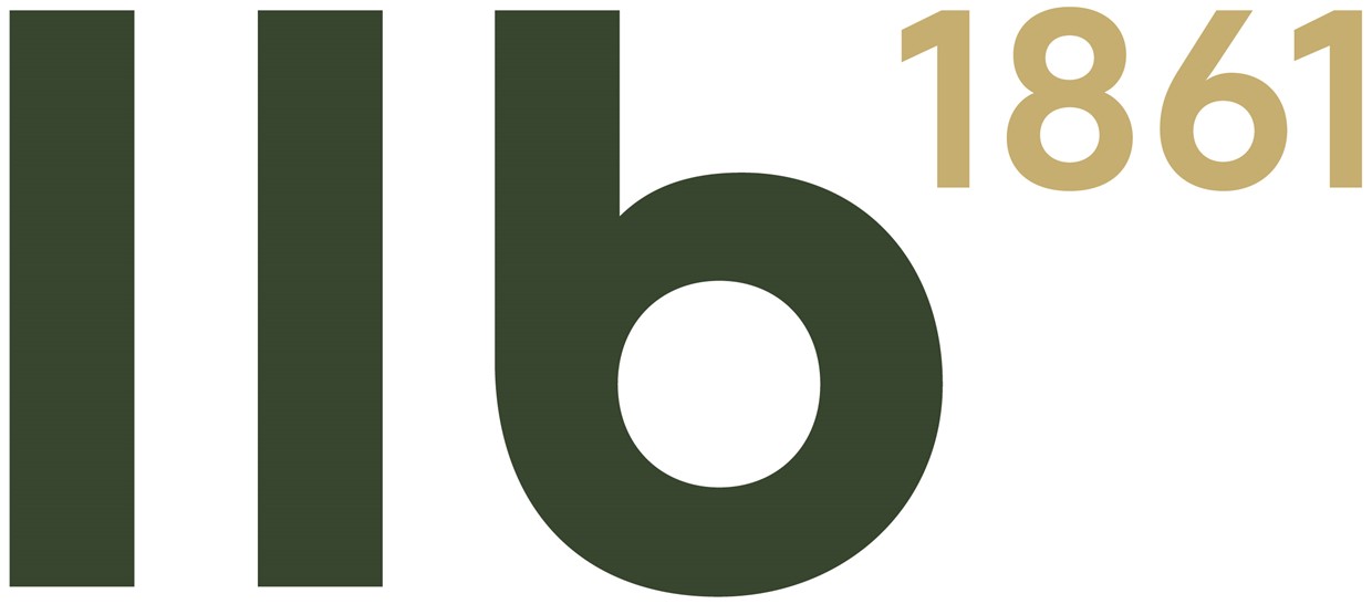
Modern, forward-looking logo
The logo has been redesigned to highlight and foster modernity and self-confidence as well as international recognition. The full name “Liechtensteinische Landesbank” is replaced by the three distinctive letters “LLB”. The combination of small letters and the date emphasise the bankʼs contemporary outlook and its rich tradition. The bankʼs origin and and traditional stability are accentuated by the date.